EQUATORIAL SPACE SYSTEMS
INTRO
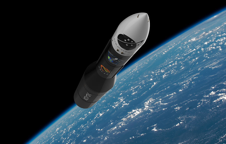
Equatorial Space Systems (ESS) is a Singapore-based space tech startup focused on developing technologies for space launch. Founded in 2017, the startup had since went on to complete its first test flight and is currently looking to expand their client base and to secure funding for research and innovation.
One of the identified methods to achieve this is to improve the startup's online presence and branding, with an emphasis to use the website as a key area for exposition and communication to clients and investors.
MY TASK
Research
Through interviews and usability testing, I looked to understand the behaviour and motivations of our two main target audience; Clients and Investors. By identifying pain points when using the current site, I mitigated them and created an experience that suits user needs.
Design
Taking into account from the results of the research, I constructed an Information Architecture that is easy to understand, designed a website that fits the profile of the company, as well as ensuring information found on the site is being relayed effectively and efficiently.


CURRENT WEBSITE
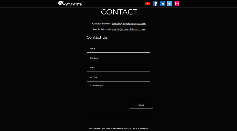
At first glance, several areas of improvements can already be identified in terms of the font usage, layout and structure. Upon further inspection, I found that accessibility and navigation of the site also require some fine tuning.
CONDUCTING RESEARCH
Usability Test
A usability test was conducted as a means to identify choke points and gather behavioural data of our target audience. Between "Client" and "Investor", they have different motivations and the types of information that they are looking for on the site differs.
For each of "Client" and "Investor", the testers were asked to visit the website to retrieve the relevant information that they need respectively. From there, they will then try to get into contact with ESS via the site.
During the test, observations like "Actions taken", "Problems encountered" and "Comments" were recorded and noted down.
User Interview
Through user interview, the aim is to further understand what the user looks for from the website. Beyond that, feedback in terms of the general usability of the site can also help point to the areas that needed improvements or changing.
Testers were asked to give their take on what they expect to see from the site, what they like/dislike, and what needs to be changed.
INFORMATION ARCHITECTURE

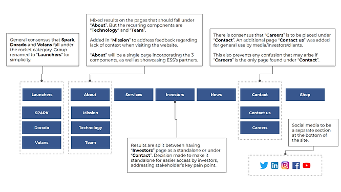
Following data obtained from the research and discussions with ESS, changes to the Information Architecture were proposed based on both user feedback and stakeholder needs. This involved the addition and removal of some pages. The result was put through a card sorting exercise to validate and improve the IA.

An open card sorting exercise was conducted and the results were collated. There was a similar trend in the sorting as most users have similar opinions on how the IA should be structured.
DESIGN CONSIDERATIONS
Ease of access to information
A recurring problem users faced was the difficulty in finding the relevant information they were looking for. From company details to rocket specs, users find themselves scouring the entire website because there wasn't any proper information hierarchy.
Amount and relevancy of information
Feedback mentioned that there were also considerable amount of redundant information found on the website, on top of a lengthy reading. In addition, the homepage itself failed to provide proper context as to the nature of the business by the company.
Ease of navigation
There were difficulties navigating the site as the header was missing in every page except Home. Pages that people would expect to see like "About" is non-existent, causing confusion when browsing the site
Font legibility
The choice of using a unique typeface that is more "space-y" made the web experience a tough one as it was frustratingly hard to read.
FINAL PRODUCT

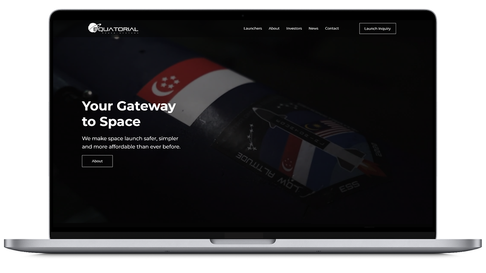
Keeping the design considerations in mind, the goal is to ensure that information is being exposited in clear, concise and digestible manner. The IA is structured for quick access (<2 clicks) to all information that the users need. Montserrat is used as the typeface for easy readability.
The website can be found here.