CONTENT MANAGEMENT SYSTEM

INTRO
Migration of the Sephora website and app to a Content Management System. Leveraging our extensive Design System to build the CMS, we created a syncing library, both in design and in code. This ensured scalability and consistency across our digital touchpoints, reducing design and development efforts.

STRATEGIC ROLE OF UX
UX plays a strategic role in the migration -
-
Coordinating with business stakeholders to ensure existing page content and functionalities migrated.
-
Standardise look and feel, implementing UI changes to improve visual coherence and responsiveness of the page.
-
Work with the engineering team to ensure feasibility and a true-to-design end product.


ENHANCE & OPTIMISE EXISTING USE CASES
The project kickoff began with an audit of the existing site - uncovering design inconsistencies and conducting an extensive heuristics evaluation with the internal teams managing the site. Through this exercise we managed to take on board the pain points and identified areas for improvements.
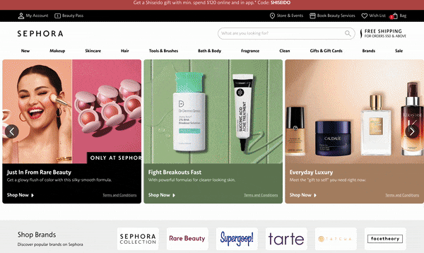
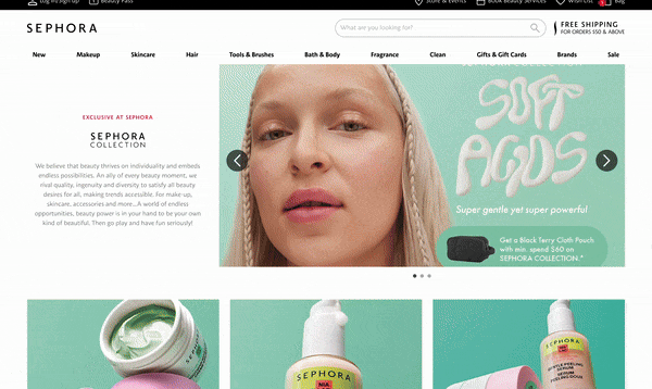
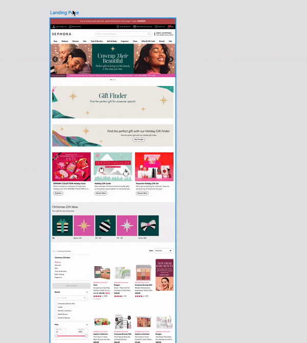
Enhancements and optimisations of the pages were made with scalability in mind (languages and image dimensions) to reduce man hours needed to maintain the site. Through feedback (both users and internal stakeholders), we improved the interface by maximising the usage of imagery and content, giving a vibrant but clean interface for our users.
RESPONSIVE DESIGN
By leveraging flexible layout techniques such as CSS Flexbox and incorporating max-width constraints, the site was meticulously designed to be fully responsive and adaptive to a wide range of screen sizes and resolutions. Every component—regardless of its complexity—was built with these principles in mind, ensuring a consistent and cohesive visual experience across all devices. This approach not only maintains design integrity but also enhances the usability and accessibility of the platform.
In close collaboration with the engineering team, we ensured that the final build stays true to the original design vision. Through continuous feedback loops, we aligned on every detail, ensuring that the user interface is both visually accurate and functionally robust.


DESIGN SYSTEM
The CMS is fully integrated with the Design System, ensuring consistency and scalability throughout the development process. By adopting the Atomic Design methodology, we establish a clear alignment between design and front-end implementation, promoting modularity and reusability. This approach breaks down the interface into building blocks, from atoms to molecules, enabling a more streamlined and efficient workflow.
Each "atom" and "molecule" within the design system was designed and documented in Figma, tested on Storybook, before being developed into components. This ensures that the components are standardised, consistent, and easily accessible for development. The CMS leverages these components to dynamically assemble content-rich pages, ensuring flexibility, responsiveness, and seamless user experiences across the platform.