COMFORTDELGRO ZIG (PART 2/2 DESIGN)

INTRO
Following the usability test results and insights gathered, we made further improvements to our prototype and arrived at our first iteration of the CDG Zig app. This design will serve as our base as we look to transition and transform the current app into it.
Concurrently while we were designing, we were also working on a new Design System that will standardise the design language across all our services and products. Every ComfortDelGro digital touchpoint will utilise this Design System to create a seamless experience for our users.

HOMEPAGE
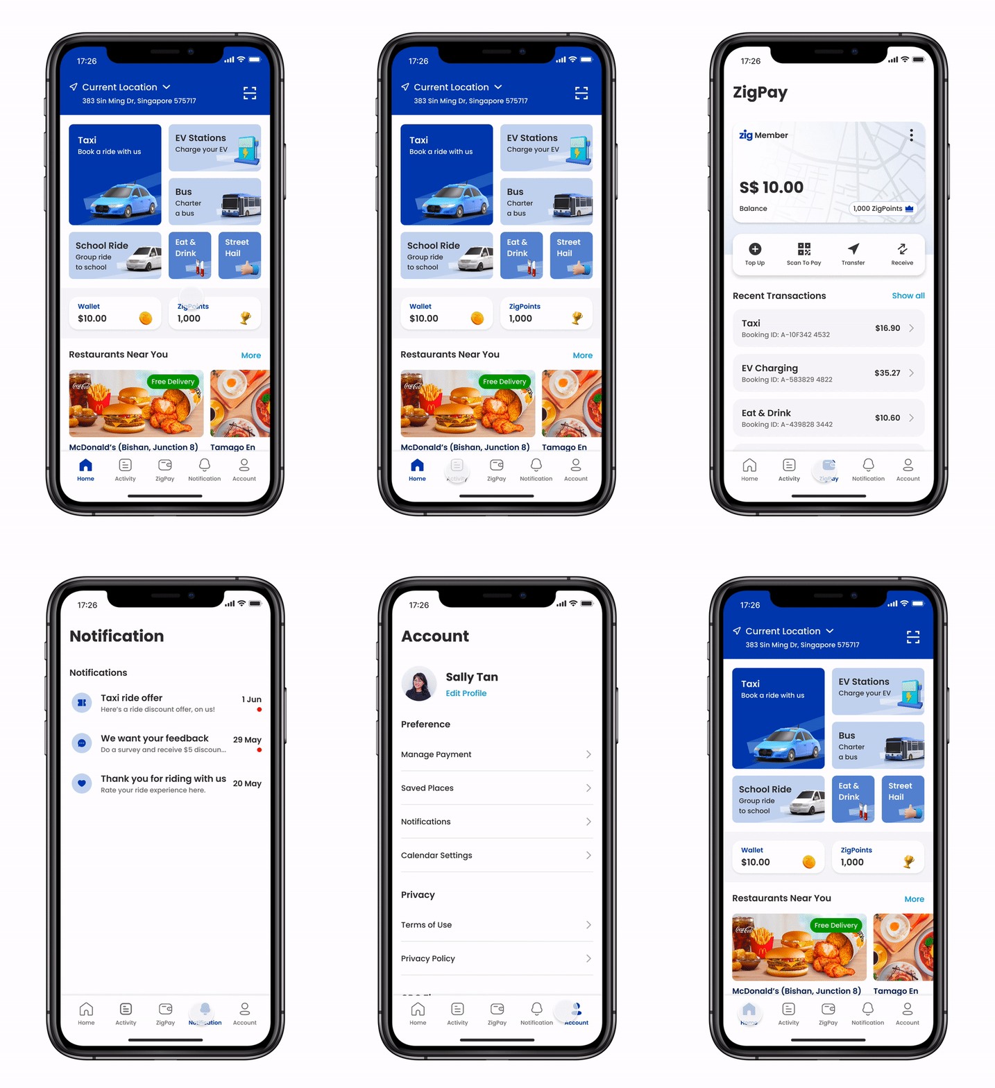
The homepage features a "shopfront" which consist all of CDG Zig's existing services. A larger real estate is given to taxi booking as it gives emphasis on the app's most prominent service. Users appreciate this as their focus are naturally drawn to it when they first open the app.
The size of the real estate for each service is determined by its importance deemed by the stakeholders, as well as the DAU. The order, arrangement and number of services are also dynamic so that when future services are introduced, we can cater space for them.
From the homepage, every service and platform feature on the app is within 3 clicks - ensuring everything is on the user's fingertips. Platform features we are referring to are Search, Activity, e-Wallet, Loyalty Program, to name a few.

TAXI BOOKING
Updated UI changes for our taxi booking service. Instead of showing a map view, the team opted to go with a landing page with a search bar and a list view of recent and favourite locations.
From a business and user perspective, it helps to save cost and loading time as it eliminates the unnecessary need for an API call to open the map, given that user have to input their destination first. The map only launches once the user confirmed the destination and their intention to search for a ride.

MENU ITEMS
The nav bar includes Account, Activity and Notification. All of these serve as a centralised platform to configure and manage the services that CDG Zig has.
On the Accounts page, saved locations will show up when users are booking transportation services. Payment method configured on page will apply to all services when users check out.
For every bookings made on CDG Zig, users can view, cancel or reschedule them on the Activity page.
Push notifications from the app or the individual services will also be consolidated and displayed on the Notification page.

E-WALLET
An e-Wallet will allow users to seamlessly make payment for the services on CDG Zig. It is tied to the loyalty program so they are able to earn more points and in turn redeem more rewards as they spend. A payment and loyalty system will encourage stickiness and user retention if implemented well.
The loyalty program will feature different tiers depending on the overall amount spent using the e-Wallet. At different tiers, users earn points and receive rewards corresponding to their tier level.


SUMMARY
During our research phase, we validated the need to create a unified shopfront, list out feature sets and prioritised them. We drafted and tested the prototype, before arriving at the first iteration of this design.
Moving forward, we want to continually iterate and improve the design, test and validate features as we roll them out.
Finally, we want to ensure the experience across all our digital touchpoints is seamless and speak the same design language. A Design System was created to facilitate this and enable us to design at scale.

DESIGN SYSTEM
With the intention to rebrand and consolidate its digital touchpoints, it is important to make sure that the business units within ComfortDelGro speak the same design language. By doing so, it also becomes easier when we integrate the various services into CDG Zig.
Using the Design System as our source of truth, we ensure future designs will not stray from our existing ones when we have a guide in place, keeping consistency.

COMPONENTS
We adopted atomic design principle when creating our Design System. After making sure the basics like typeface, colours, margin and padding were in place, we created building blocks like buttons, text fields, controls before arranging them into components.
We stopped just short of a page template because the layout of every page differs from each other due to the nature of the different services, one template would not be applicable to the other.
Using Figma to create the Design System, we also made use of their variant feature to create component variants, allowing greater freedom of customisations when designing.

MODULAR SERVICE LIST
An example of atomic design principle in play along with variant sets of components.
In our component, we created individual "Service" cards with varying sizes. The sizes denotes the level of importance and emphasis we want the service to have. These Service Cards with differing sizes are our set of variants
Using the different sizes of cards, we arranged them and created a "Service List" module, which will be found on the app's homepage. This Service List is modularised to contain a "3 Services" version, going up to 7. This was in anticipation for the future as we introduce more service into the app.