BEAUTY PROFILE

INTRO
Beauty Profile aims to capitalise on member data (explicit & implicit) with Sephora's extensive brand and category offerings to provide unbiased and contextual recommendations that meet their needs across categories, to differentiate ourselves as the go-to beauty expert and deepen customer loyalty.
WHY BEAUTY PROFILE
From our market survey, 74% of consumers have abandoned carts because they felt overwhelmed. Finding the right beauty product isn't easy as shoppers are often deluged with choices leading to decision paralysis.
In our efforts to ramp up personalisation for our users, building understanding of individual users is of utmost importance. By consolidating explicit and implicit information, we can serve relevant and unbiased product recommendations to inform decision making.

PROOF OF CONCEPT PHASE
We introduced a short quiz section on skincare related category listing pages and users were prompted to fill up their skin type and skin concerns. The inputs were then matched against the catalog of products and their respective product taggings. The output is a list of product that "best matches" with the user's skin type and concern.
The result of this implementation saw a 9% increase in Add To Cart rate comparing between users with quiz interaction (35%) vs without quiz interaction (32%). We also saw 3x high organic quiz completion rate (4604) as compared to the old Beauty Profile (1548).


BEAUTY PROFILE
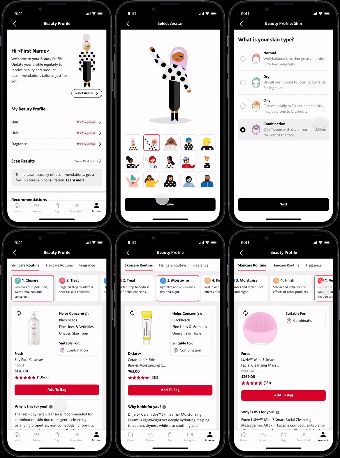
In the next phase, we expanded the quiz to include haircare and fragrances. For the output, we worked with our in-house Beauty Advisor training team to come up with skin and hair routine recommendations, mapping type and concerns to product categories.
-
Beauty Profile recommends skin/hair routine based on user's profile.
-
Recommendation comes with a short description explaining why product is suitable for them.
-
One product is recommended per routine step.
The goal is to curate a similar experience that a user would have if they go in store and speak with a Beauty Advisor.

PRODUCT RECOMMENDATION
When recommending a product, we only show a single product per routine step to the users. This gives the impression of a targeted, specific recommendation from us, as opposed to showing a carousel, which can potentially create decision paralysis.
In the design, the specific type and concerns that the product is suitable for is labelled for the user. A short write up at the bottom explains why the product is recommended to them. To scale this, the write up is AI generated, prompt engineered to only use the rightful product claims to prevent hallucination.